Some album covers are so important that they almost become as famous as the music they’re appearing with. Some album covers are, well, not quite so impressive. This new series will look at great bands who make a habit of having bad album covers. Starting with R.E.M.
It would take a bold person to dismiss the work of the Alt. Rock legends, and some of their output (I’m looking at you, New Adventures in Hi-Fi) as anything less than musical brilliance. But, sadly, their album covers lurched from one uninspired disaster to another. Let’s take a look at their top 5 shoddiest efforts, beginning with their debut release Murmur from 1983.

Apparently this is ‘a field covered with kudzu vines’, but to me it’s a dreary mess of bland colours and the kind of landscape you’d quickly walk past if you came across it out in the woods for fear something might lurch out from behind whatever the Dickens that is in mid-shot.
Things didn’t get much better on the following year’s Reckoning, either:
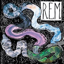
A multi-coloured snake? An extremely long condom left on a pavement? One of those oversized gummy worms you can sometimes get in Pick ‘n’ Mix? Whatever it is, it’s another shocker of an album cover.
1986’s ‘Life’s Rich Pageant’ up next:

Half black and white photo of drummer Bill Berry, half sepia-toned photo of some buffalo = complete mess. An apostrophe would’t have been a bad idea, either.
A bit of a gap now, but 1998’s Up showed that even though they were now continuing minus Bill Berry, at least there was consistency with their album art.

Looking like a GCSE student’s graphic art project, this duffer didn’t even have the usual high standard of music to rescue it.
Last, but by no means least, we visit 2008’s Accelerate, which musically I rate as one of their best efforts. Shame about this, though:

The decision to have the band name in a summer of love-vibe typeface zooming out over the metropolis wouldn’t have been a bad idea if it didn’t appear in a stark monochrome. Looks like the poster for the most boring superhero film ever.


Leave a comment